Ask any marketer and they’ll tell you, having a website is great and all, but if you actually want more leads, referrals, or sales, a strong landing page is where the magic happens.
The best part is you don’t need to be a tech nerd to create one. With a few easy to use tools (hello, drag and drop editors), you can create a landing page that looks clean, feels professional, and actually gets people to click that shiny button.
How to Create a Landing Page (for those on the run)
A landing page has one job, which is to get people to act. Landing pages have many use cases such as signing up, buying, or grabbing your freebie, whatever it is, every part of the page should point to that goal. Simplicity is key and knowing what you want visitors to do. Be sure to make it clean, use persuasive copy and use visuals that add to the page. Use social proof to build credibility and a clear call to action.
Don’t overthink it. Use a template or AI tool, tweak it to fit your style and test it fast. Once it’s live, track how it performs and share it through ads, emails, SEO or even social media.
What Is a Landing Page?
A landing page is basically a focused web page built for one job, to turn interest into action. It’s where someone ends up after clicking an ad, email, or social post. Unlike a full website that tries to do fifty different things, a landing page keeps it tight: one goal, one message, one action.
Think “Sign up for our free webinar” or “Buy now and save 20%.”
By removing all the usual distractions such as menus, extra links, random content etc, you guide people straight to the point. That’s what makes landing pages so good at converting clicks into customers.
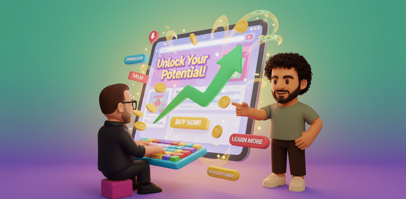
Landing Page Purpose
The whole point of a landing page? Conversion. That’s it. Whether it’s capturing leads, driving sales, promoting an event, or growing your email list it’s designed to make one specific thing happen.
Marketers, small business owners, startups – everyone uses them for launches, ads and testing ideas. In simple terms, having a landing page is your best option when it comes to any type of promo.
How to Create a Landing Page in 13 Steps
Lets get to the practical side of the article, I will now guide you through creating a landing page of your very own. Here’s your simple, 13 step guide to creating a landing page that looks great, feels smooth, and turns clicks into conversions.
01. Define Your Landing Page Goal
First is to define the goal. What action do you want people to do when they get there? Sign up? Buy something? Download your ebook? Be specific. It shapes everything else. If the goal is to promote a webinar for example, your page should highlight the benefits of joining, not just “Register Now.”
Also, understand why your audience is visiting in the first place. What’s their problem? What are they hoping to fix? When you nail that, your page feels like it’s reading their mind and that’s when they convert.
02. Choosing a Platform
If you’re good with coding you can build your landing page from scratch with HTML and CSS. If not (and let’s be honest, most of us aren’t), platforms and website builders such as Wix, Webflow, or Leadpages can be great as they’ve got plug and play templates that look great out of the box.
Having a domain linked to your landing page will give it a more professional look, it’s not the most important bit of the landing page but does help give it that expert touch.
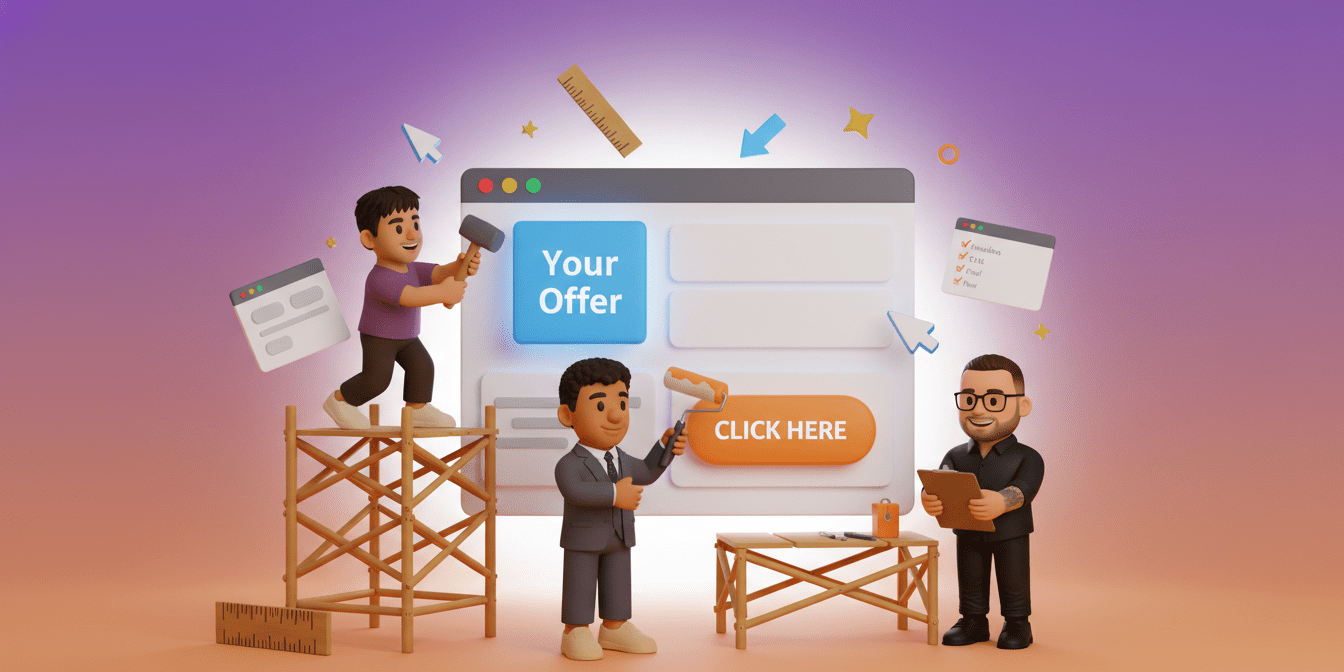
03. Landing Page Templates
Templates can save you a ton of time when building a landing page. Most platforms come with ready made designs, pick one that fits your product or brand. If you’re showing off a product, choose a layout that gives visuals and key features some breathing room. If you’re collecting emails, choose one with a form front and center.
Then make it yours. Change the colours, fonts, and images until it feels like your brand, not something pulled from a template. Those little tweaks can do a lot for how people see and trust your page.
04. Attention Demanding Headline
The headline is the first thing people see, and it decides whether they stick around or not. Make it clear, make it useful, and skip the filler. Nobody reacts to “Welcome to Our Site,” but something like “Double Your Leads with This Free Toolkit” actually tells them why they should care.
A short subheadline can help too — it gives a bit more context or adds that gentle push to act. Phrases like “Limited Time Offer” or “Only 24 Spots Left” work well for that. Keep it short, easy to read, and focused on what the reader gets out of it.
05. Write Copy That Focus on Benefits
Let’s be real for a second, no one’s reading a wall of jargon. Say what matters, keep it short, and talk about what’s in it for them. People will 90% of the time just skim the page so use bullet points or bold bits to highlight benefits or anything important. Every sentence should push them closer to clicking that CTA.
Bad: “Our product is easy to use.”
Good: “Get started in minutes without needing tech skills needed.”
Bad: “We offer fast delivery.”
Good: “Get your order delivered in 24 hours.”
06. Design for Simplicity – Less Is More
Don’t overcomplicate it. Seriously. Keep your layout clean, your colours minimal, and your text readable. White space is not wasted space, it’s breathing room for the eyes. Ditch unnecessary links or menus.
A landing page should be a one way street straight to your goal, no exception. A simple, focused design feels more trustworthy and keeps people from bouncing.
07. Create Action Driven CTAs
Your call to action is where everything comes together, so make sure people can’t miss it. Use clear action phrases like “Get Started Today,” “Claim Your Free Trial,” or “Join Now.” Give the button a colour that pops against the rest of the page — no one should have to go looking for it.
If your page runs long, drop a few CTAs along the way, some near the top, some in the middle and again at the end. People scroll fast, so that button should always be close by.
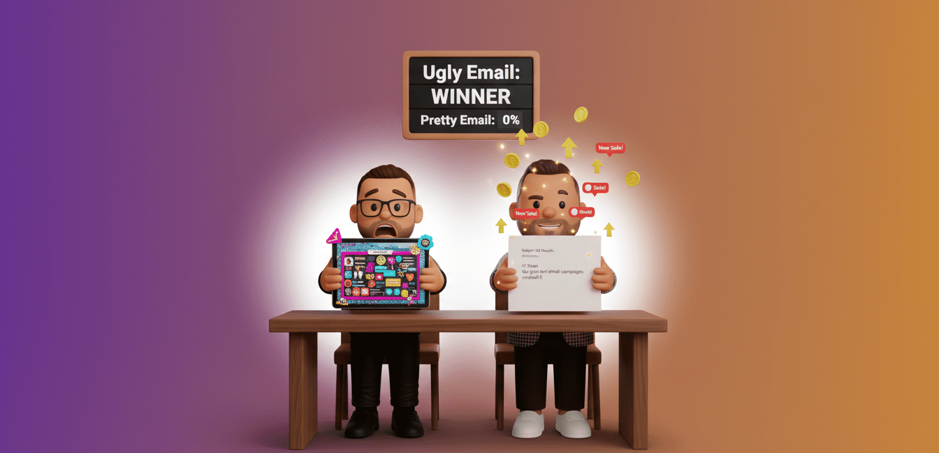
08. Use Visuals Strategically – Show, Don’t Just Tell
Visuals are your secret weapon. Use them to prove your point, not distract. Display your product should in action, show real customers and use real results. If it’s an online course, throw in a short video of what it looks like or a quick testimonial clip.
Avoid boring, generic stock photos they scream “fake” and obliterate trust. Keep file sizes light so your page loads fast because nobody’s sticking around for a slow loading website.
09. Add Social Proof
People trust people, not random websites. Add testimonials, reviews, case studies, whatever proof you’ve got that your thing actually works. Make it specific. “Increased my conversions by 40% in two weeks” hits way harder than “Loved it!”
You can also include logos from press features, awards, or brand partners. Basically, show that real humans trust you and new visitors will too.
10. Mobile Optimisation
Half your visitors are probably scrolling on their phones right now. If your page looks off on mobile, you’re already losing them. Your layout should work on every screen size. Test it on your phone, if you have to squint or zoom, fix it. Bigger buttons, fast load times, no excuses.
Aim for a simple, fast mobile setup. When it’s easy to scroll and nothing breaks, people stay longer and take action.
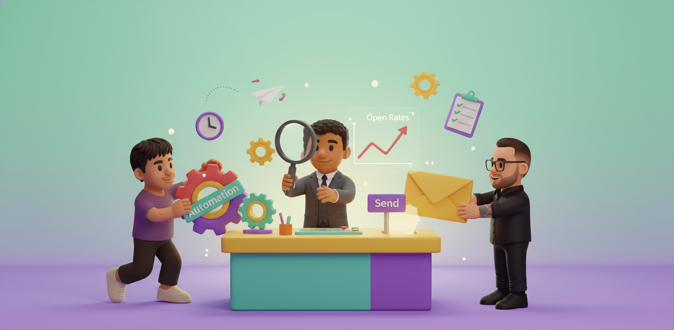
11. Track And Measuring Performance
Don’t assume or guess anything when it comes to your landing page’s performance. Use tools such as Google Analytics, Meta Pixel or your platform’s built in tools to analyse what’s happening. Important stats to really keep an eye on is your conversion rate, bounce rate and where people drop off.
If something’s not clicking (literally), fix it. The numbers will tell you what’s working and what’s just taking up space to look pretty.
12. Test and Optimize
Once your landing page is live you can start the optimizing and testing phase. A/B test headlines, colours, CTAs, and even images. Sometimes the smallest change can drastically increase your results.
Keep testing and iterating to find improvements. Landing pages should not be treated as a “set it and forget it.” The more you tweak the better it gets, which can snowball over time into better results.
13. Traffic To Your Landing Page
Now we need to get traffic to the landing page, your page can be the best landing page in the world but if no one is going to see it, it will just be empty space on the internet. Promote it in every possible way.
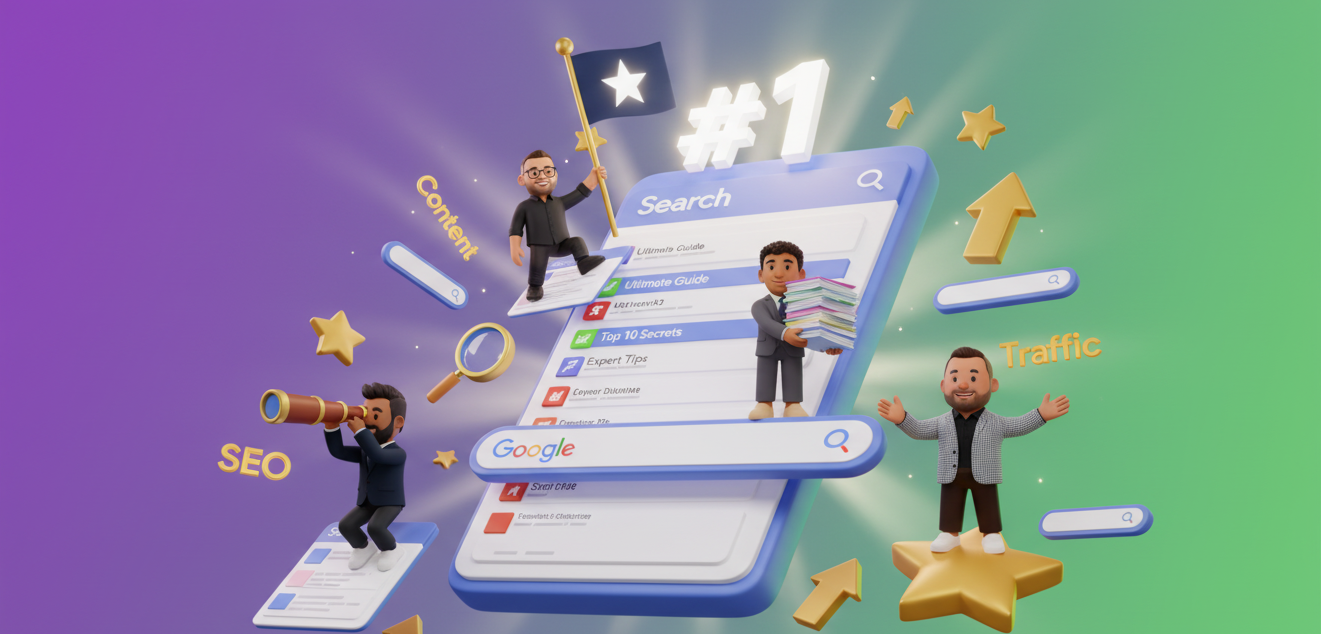
Use Meta and Google ads to drive traffic or even social media sites if you have a large following by placing the link in your profile. Share it in emails and even use SEO so it shows up in search for specific search terms.
What Are Landing Pages Good For?
In digital marketing, landing pages are conversion machines. They exist to drive one clear action, buy now, sign up, download, whatever your goal is. Unlike a full website that’s got menus and distractions, a landing page keeps the focus locked. That’s why they convert way better for specific campaigns or offers.
Landing pages have been around since the early 2000s (Microsoft actually used them first to sell Office software), and now they’re a staple of every serious marketing strategy.
There are two main types:
- Reference landing pages – built to inform or educate about something specific.
- Transactional landing pages – designed to push action, like filling out a form or buying something.
Either way, they’re all about one thing, turning clicks into results and if you need help building a landing page that converts? Our team can design and optimise it for you, get in touch today.


 Boost open rates